Your 404 Page Is Lost. Its Personality Doesn’t Have to Be.

“This is one of those tiny website details that most people won’t consciously notice when it’s done well, but they’ll absolutely feel the difference.”
You meticulously designed your homepage. You rewrote your About page 47 times. You selected exactly the right shade of almost-black and spent an uncomfortable amount of time deciding whether a button should say “Learn More” or “Let’s Do This.”
But your 404 error page?
It’s still standing there in its default outfit, awkwardly telling people that the page they requested cannot be found.
A 404 page appears when someone tries to visit a page on your website that doesn’t exist. Maybe they clicked an outdated link, mistyped the URL, or landed on a page you’ve since removed. Something went wrong, but that doesn’t mean the experience has to. A custom 404 error page can turn a tiny website failure into a memorable, helpful, and completely on-brand moment. And frankly, if your website is going to fail, it should at least be funny.
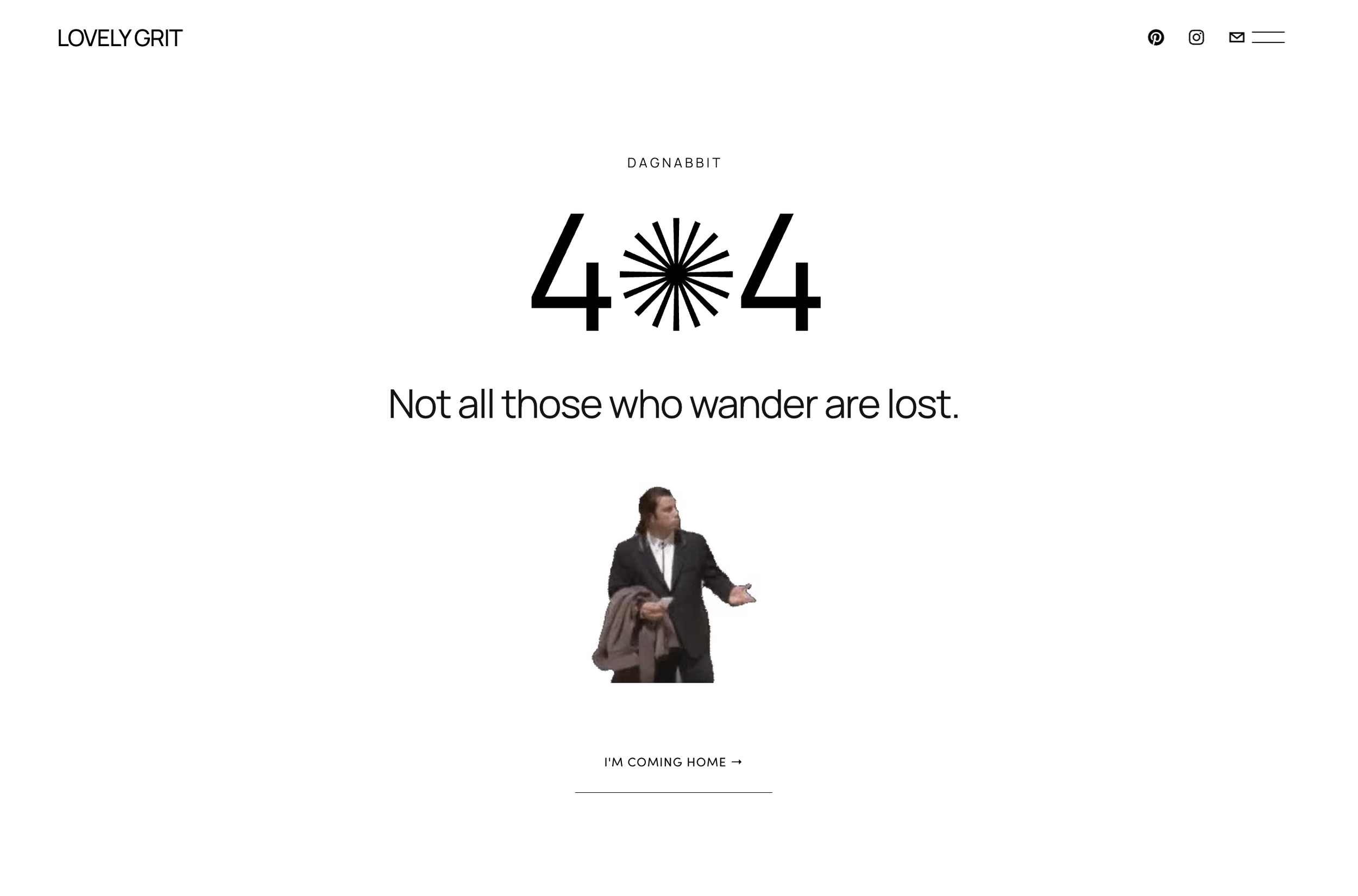
So What Is a 404 Error Page Exactly?
A 404 page is the page visitors see when the URL they’ve requested can’t be found on your website.
This can happen when:
A page has been deleted or renamed
An old link is still circulating online
Another website links to the wrong URL
Someone mistypes part of your web address
A visitor attempts to find a page that never existed in the first place
Every website will eventually send someone to a 404 page. Even the pretty ones. Even the expensive ones. Even the one you swore you checked fourteen times before launch. You can’t prevent every broken link, but you can decide what visitors experience when they find one.
Why Your Custom 404 Page Actually Matters
A 404 error interrupts the visitor’s journey. They expected to find something and instead reached a digital dead end.
A generic message makes that interruption feel more frustrating. It doesn’t explain what happened in a human way or help the visitor decide where to go next.
A thoughtfully designed 404 page can:
Reassure visitors that your entire website isn’t broken
Help them find what they originally wanted
Keep them from immediately leaving your site
Reinforce your brand voice and personality
Transform an error into a surprisingly enjoyable interaction
This is one of those tiny website details that most people won’t consciously notice when it’s done well, but they’ll absolutely feel the difference. Good web design isn’t only about how a website looks when everything goes according to plan. It’s also about what happens when someone gets lost.
Should a 404 Page Be Funny?
It can be, and I’m enthusiastically in favor, but funny isn’t the only requirement. Your 404 page still has a job to do. The humor should support the experience, not leave visitors laughing alone in the wilderness with no way back to civilization.
The best funny 404 pages combine three things:
A clear explanation of what happened
Copy that sounds like the brand
An obvious next step for the visitor
Think of the personality as the welcome mat, not the entire house. If your brand voice is playful, irreverent, conversational, or slightly unhinged in a charming way, your 404 page is a perfect place to let that show. If your brand is more polished, serious, or sensitive, you can still create something warm and human without forcing a joke that doesn’t belong. The goal isn’t to make every brand funny. The goal is to make every page feel like it belongs to the same brand.
What to Include on a Custom 404 Error Page
You don’t need to turn your 404 page into a second homepage. It should be simple, useful, and easy to understand.
1. A Clear 404 Message
Visitors need to know that they reached the page because the requested URL couldn’t be found—not because your entire website spontaneously combusted.
Your headline can be direct:
Page not found.
Well, this is awkward.
You appear to be lost.
This page has left the building.
Error 404: We have no idea where that page went.
Choose language that fits the rest of your website. If your brand never jokes anywhere else, suddenly performing stand-up comedy on the error page may feel more confusing than clever.
2. A Short Explanation
After the headline, explain what may have happened in one or two sentences.
For example: “The page you’re looking for may have moved, disappeared, or never existed outside your imagination.
Or something more straightforward: “The page you requested couldn’t be found. The link may be outdated, or the page may have moved.”
Visitors don’t need the technical history of HTTP response codes. They just need enough information to understand that the problem isn’t theirs to solve.
3. An Obvious Way Out
Never make someone use the browser’s back button as their only escape route. Include at least one prominent button leading somewhere useful, such as:
Return to the homepage
Explore your services
View your portfolio
Read the blog
Visit your shop
Contact you
For a service-based business, I’d usually lead visitors back to the homepage or services page. If your website contains a lot of content, you might also include a search bar or a few popular links. The right next step depends on what people are most likely to look for when they visit your website.
4. A Memorable Visual
A custom illustration, branded photo, GIF, or unexpected graphic can make the page feel intentional instead of forgotten. The visual should still work with the rest of your website. Use your brand colors, fonts, image style, and overall creative direction. Your 404 page can have a little more freedom than your primary sales pages—but it shouldn’t look like it wandered in from an entirely different website.
5. Your Brand Personality
This is where the page becomes more than functional. If your website speaks with humor everywhere else, carry that humor into the error message. If your brand is warm and encouraging, make getting lost feel strangely comforting. If your brand is bold and unconventional, don’t suddenly default to robotic website language. “Sorry, the page you requested could not be located” technically works. But nobody has ever read that and thought, Wow, I need to hire whoever made this.
Creative 404 Page Copy Ideas
Need a starting point? Try one of these and adapt it to your own voice.
Funny and conversational
Well, this is awkward.
The page you were looking for has apparently made other plans.
Slightly chaotic
Nothing to see here. Literally.
This page is missing, but the rest of the website remains mostly under control.
Dramatic
This page has left the building.
No note. No forwarding address. Honestly, we’re taking it personally.
Helpful and polished
You’ve wandered off the map.
The page you’re looking for may have moved, but we can help you find your way back.
For a creative business
Even our mistakes are custom.
This page doesn’t exist, but plenty of good design does.
For a therapist or wellness brand
Feeling lost happens.
The page you’re looking for isn’t here, but you can return home and begin again.
That last example is a good reminder: effective website copy doesn’t come from pasting the trendiest joke onto every business. It comes from understanding the audience, the emotional context, and the personality behind the brand.
How to Create a Custom 404 Page in Squarespace
Squarespace allows you to replace its standard system error page with a page you’ve designed yourself.
The general process is simple:
Create a new page for your custom 404 design.
Keep it out of your main website navigation.
Add your message, visual, and button or helpful links.
Open your website’s page or system settings.
Select your new page as the website’s custom 404 page.
Save your changes and test a fake URL on your domain.
For example, type something after your domain that you know doesn’t exist:
yourwebsite.com/this-page-is-definitely-lost
Your custom design should appear. Squarespace settings and menu labels can vary by version, so if you don’t immediately see the custom 404 option, search your site settings for “404” or “system pages.”
Custom 404 Page Design Tips
Before you send your newly lost page into the world, check a few things.
Keep the navigation available
Visitors should be able to access the rest of your website easily. Keeping your normal header or adding clear navigation options prevents the page from becoming a true dead end.
Make the main button impossible to miss
Your visitor is already disoriented. This is not the moment for a mysterious beige text link hiding in the footer.
Use one obvious call to action that helps them continue.
Check the mobile version
Your brilliant punchline is less brilliant when half of it disappears beyond the edge of an iPhone.
Test the spacing, text size, image crop, and button placement on mobile—not only in the desktop editor.
Don’t overload the page
A 404 page doesn’t need your entire life story, Instagram feed, latest twelve blog posts, newsletter form, personality quiz, and birth chart.
Give visitors a little personality and a clear direction. Then let them move on.
Fix known broken links too
A delightful 404 page is a safety net, not a substitute for website maintenance.
If an important page has moved, update links that still point to the old address and create a redirect when appropriate. Visitors shouldn’t repeatedly reach an error page just because it happens to be cute.
The Best Websites Pay Attention to the Weird Little Corners
Your homepage may get most of the attention, but your brand doesn’t stop existing when someone takes a wrong turn. Confirmation messages, contact forms, button copy, mobile layouts, empty screens, footer details, and error pages all contribute to how a website feels. These moments separate a website that was simply assembled from one that was thoughtfully designed. A custom 404 page probably won’t be the reason someone visits your website. But it may be the unexpected detail that makes them remember it. And in a sea of websites using the same layouts, the same button copy, and the same politely professional language, being remembered is kind of the whole point.
Want a Squarespace Website That Doesn’t Feel Copy-and-Pasted?
I design strategic, personality-filled Squarespace websites that consider the entire brand experience—including the pages most people forget exist. Because your website shouldn’t only function. It should sound like you, connect with the right people, and make your business difficult to confuse with anyone else’s.
